2025
2025
—
—
2026
2026
Beeline design system
Beeline design system
Divider
Divider
An element used to visually separate content vertically or horizontally.
An element used to visually separate content vertically or horizontally.


Weight
Weight
Available in 2 thickness options:
1. regular — 1 px thick;
2. strong — 2 px thick.
Available in 2 thickness options:
1. regular — 1 px thick;
2. strong — 2 px thick.
Strong is recommended when a more defined and prominent separation is needed. For most other cases, the regular thickness works best.
Strong is recommended when a more defined and prominent separation is needed. For most other cases, the regular thickness works best.
regular
strong
horizontal
vertical
Orientation
Orientation
Direction can be set in 2 orientations:
1. horizontal;
2. vertical.
Direction can be set in 2 orientations:
1. horizontal;
2. vertical.
Direction can be set in 2 orientations:
1. horizontal;
2. vertical.
By default, stacked vertically content is usually separated using horizontal dividers (i. e. top to bottom). In cases where content needs to be divided horizontally, use vertical dividers instead.
By default, stacked vertically content is usually separated using horizontal dividers (i. e. top to bottom). In cases where content needs to be divided horizontally, use vertical dividers instead.
By default, stacked vertically content is usually separated using horizontal dividers (i. e. top to bottom). In cases where content needs to be divided horizontally, use vertical dividers instead.
Colour
Colour
The design system includes 2 shades of gray for borders, so I applied the same principle to dividers:
1. default — standard gray;
2. soft — light gray
The design system includes 2 shades of gray for borders, so I applied the same principle to dividers:
1. default — standard gray;
2. soft — light gray
soft
default
8
0
12
16
20
24
Spacings
Spacings
All dividers feature predefined paddings for the most common use cases: 8, 12, 16, 20, and 24. You can also select an option without padding to apply a custom spacing outside the default scale.
All dividers feature predefined paddings for the most common use cases: 8, 12, 16, 20, and 24. You can also select an option without padding to apply a custom spacing outside the default scale.
All dividers feature predefined paddings for the most common use cases: 8, 12, 16, 20, and 24. You can also select an option without padding to apply a custom spacing outside the default scale.
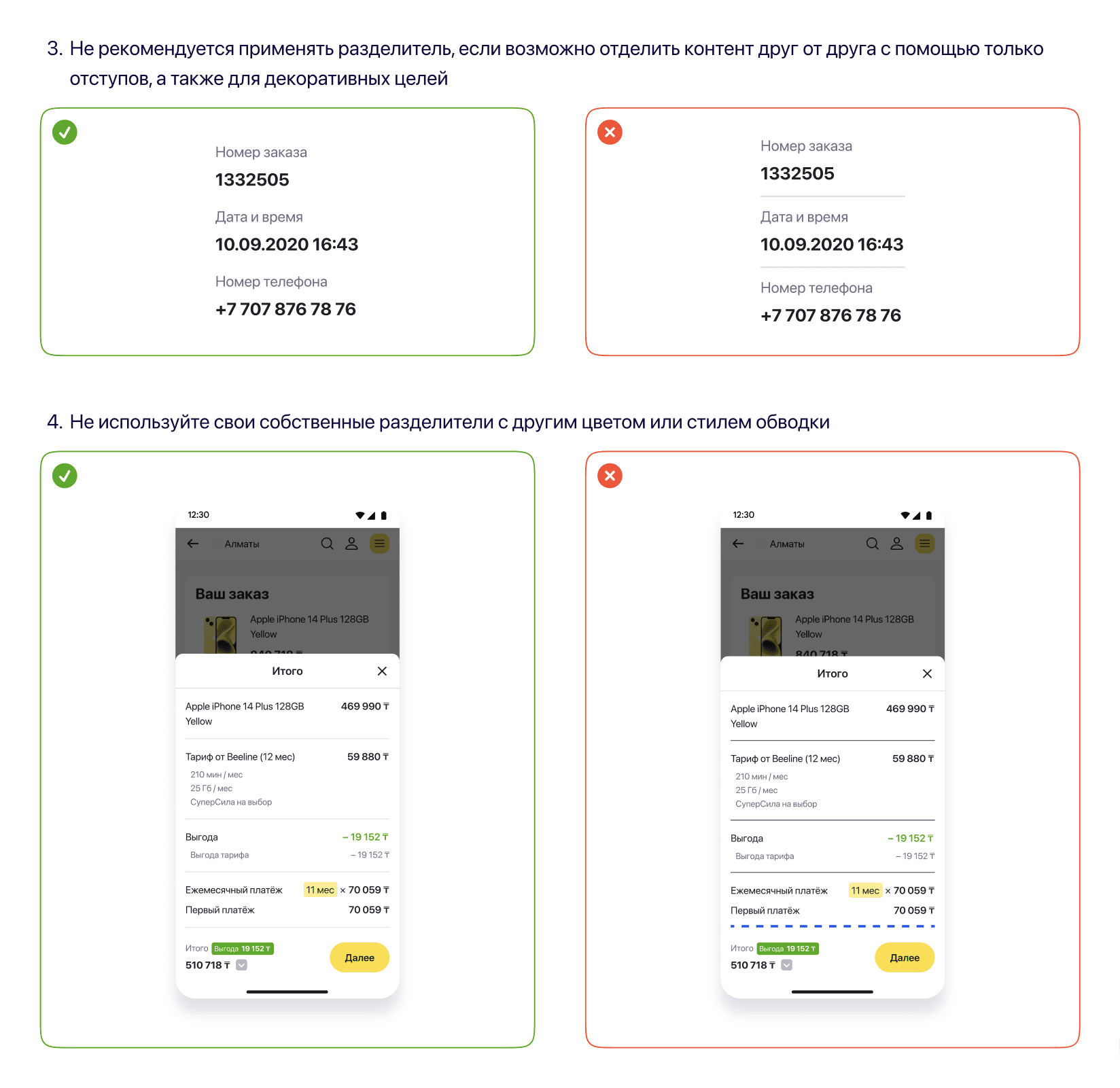
Usage guidelines
Usage guidelines

Component usage analytics
Component usage analytics
0
0
detaches since component launch
detaches since component launch
8.1k
8.1k
instances used
instances used
126
126
files containing this component
files containing this component